Home Color Schemes for Balanced Interior Atmosphere
A house can look expensive and still feel wrong the second you walk in. The sofa may be new, the floors may shine, and the lighting may be fine, but when the colors fight each other, the whole room feels unsettled. That is why Home Color Schemes matter more than most people admit.
Across American homes, from compact Chicago apartments to open-plan houses in Arizona suburbs, color has to do more than look pretty on a paint chip. It has to calm a busy entryway, warm up a family room, soften bright daylight, and make mixed furniture feel intentional. A thoughtful palette turns scattered rooms into a place that feels lived in, not staged. For more home and lifestyle ideas, resources like modern interior inspiration can help connect practical choices with everyday design decisions.
Good color planning starts with restraint. Not fear. Restraint. The goal is not to make every wall beige or copy a showroom. The goal is to build a balanced interior atmosphere where every shade has a job and every room feels connected without becoming flat.
Home Color Schemes That Shape the Mood of a Room
Color sets the emotional temperature before furniture gets a chance to speak. A navy dining room can feel intimate at night, while a pale oatmeal living room can make a noisy household feel calmer by late afternoon. The trick is knowing what mood you want before you fall in love with a swatch under store lighting.
How should a color palette match daily life?
A color choice fails when it ignores how the room gets used. A white family room may look clean in a photo, but in a house with kids, dogs, snacks, and muddy cleats, it may turn into a full-time maintenance project. A deeper neutral, like warm taupe or soft mushroom, often handles real life with more grace.
Daily rhythm matters as much as taste. A bedroom that faces a busy street needs quiet, settled colors that help the mind slow down. A kitchen where the family gathers every morning can handle more warmth, because energy belongs there. The best interior color palette begins with behavior, not decoration.
American homes often mix purposes inside one space. A living room may work as a homework zone, TV room, and casual office. In that case, loud wall colors can wear people out faster than they expect. A muted base with stronger accents gives the room personality without making every activity feel overstimulated.
Why undertones matter more than paint names
Paint names can trick you. “Cloud Cream” may sound gentle, but it might carry a yellow undertone that turns harsh beside gray flooring. “Soft Linen” may look warm online and then read pink beside oak cabinets. Undertones are the quiet troublemakers in home design.
A balanced interior atmosphere depends on colors agreeing beneath the surface. Warm whites pair better with beige, camel, terracotta, and natural wood. Cooler whites sit more easily with slate, charcoal, blue, and polished chrome. Mixing the two can work, but only when one side clearly leads.
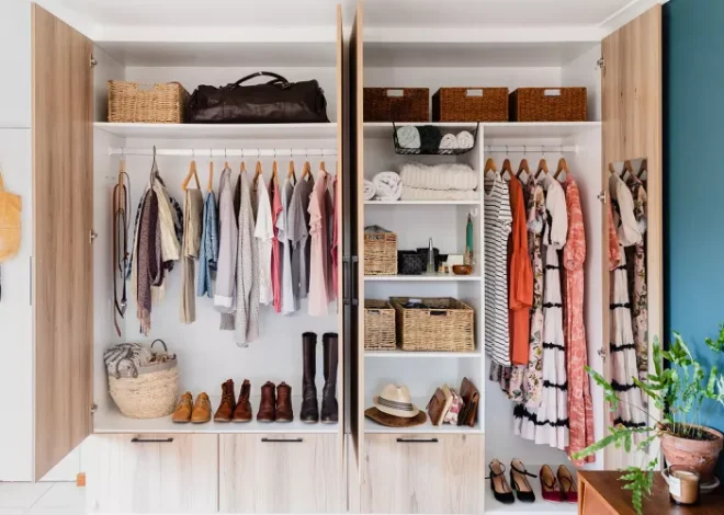
The smart move is to test paint near fixed elements: floors, cabinets, countertops, tile, brick, and large upholstery. Those pieces already have color authority. You are not choosing paint in isolation. You are negotiating with what the house already refuses to change.
Building Flow Between Rooms Without Making Everything Match
A home should not feel like one paint bucket spilled across every room. It also should not feel like five unrelated apartments stitched together by hallways. The best room color flow sits between those extremes, letting each area have its own mood while still belonging to the same house.
What creates a natural transition from room to room?
Transitions work when colors share a family connection. A sage living room can lead into a cream hallway, then into a muted clay dining room, because each shade carries softness and warmth. They do not match, but they speak the same language.
Open floor plans need extra care. In many newer U.S. homes, the kitchen, dining area, and living room sit in one long visual line. If each zone gets a bold wall color, the space can feel chopped up. A steady neutral base with accent colors repeated through rugs, art, stools, and pillows usually works better.
Hallways deserve more respect than they get. They act like visual bridges. A soft neutral hallway can reset the eye between stronger rooms, especially when bedrooms or offices use deeper tones. That pause keeps the house from feeling restless.
How can repeated accents support cohesive home design?
Repeating an accent color does not mean copying the same item in every room. It means letting one shade appear in different forms. A muted blue might show up in living room pillows, a laundry room cabinet, a bedroom throw, and artwork near the stairs.
This is where cohesive home design starts to feel natural. The repetition is quiet enough that guests may not name it, but they feel the order. The home seems calmer because the eye recognizes a pattern without being forced to stare at it.
A practical example helps. In a suburban Atlanta home with warm wood floors and cream walls, a homeowner might use olive green as the main accent. It can appear on kitchen bar stools, a framed landscape print, a bedroom quilt, and a ceramic lamp. No room looks copied, yet the whole house feels planned.
Choosing Colors Around Light, Materials, and Climate
Color changes when daylight moves, and American homes deal with wildly different light conditions. A shade that looks soft in Seattle can look washed out in Phoenix. A cool gray that feels crisp in Boston can turn gloomy in a shaded Portland bungalow. Light is not a detail. It is the room’s silent designer.
Why does natural light change interior color palette choices?
North-facing rooms often make colors look cooler and flatter. A pale gray that seemed calm in the store may turn chilly once it lands on the wall. Warmer neutrals, gentle greens, and creamy whites often bring those rooms back to life without making them feel yellow.
South-facing rooms usually get stronger light, so colors can look brighter than expected. A cheerful butter tone may become too loud by noon. Muted versions of favorite colors tend to age better in these spaces, especially in living rooms and bedrooms where comfort matters more than drama.
Western light can be tricky. Late-day sun brings orange and gold, which can push warm colors into heavy territory. That does not mean you must avoid warmth, but you need to test samples in the late afternoon. Paint tells the truth at the worst time of day, not the best.
How should furniture and finishes guide color decisions?
Fixed finishes should lead the conversation. Floors, countertops, tile, fireplaces, and cabinets usually cost more to change than paint. Fighting them wastes money and creates visual tension. Working with them makes the whole room feel calmer.
A kitchen with cool marble-look counters and white cabinets may support soft blue, pale gray-green, or clean greige walls. A living room with honey oak floors may respond better to warm ivory, clay, muted olive, or gentle tan. The right room color flow respects what already exists.
Furniture carries weight too. A dark leather sofa can ground a room, but it needs surrounding colors that soften its presence. Pale walls, woven textures, and warm metals can keep it from feeling heavy. Color is not only on the wall; it lives in every surface the eye touches.
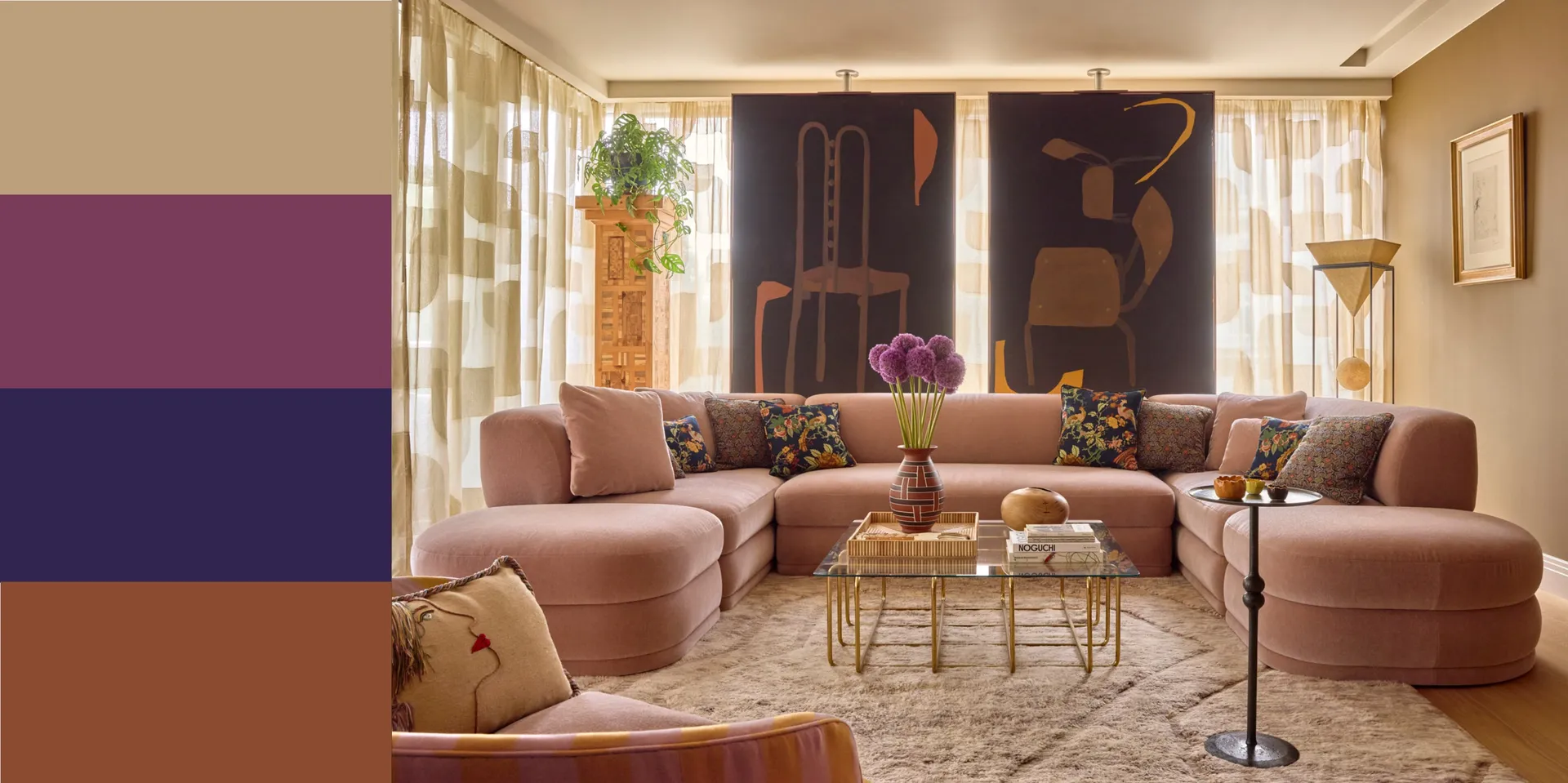
Making Bold, Neutral, and Soft Colors Work Together
Many people think they must choose between safe neutrals and bold personality. That is a false choice. Strong homes often use both. The difference lies in proportion: which color leads, which supports, and which appears only long enough to create interest.
When do bold colors improve a balanced interior atmosphere?
Bold colors work best when they have a clear role. A deep green office can help the room feel focused. A charcoal powder room can feel polished because people spend shorter periods there. A burgundy dining nook can add evening warmth without taking over the whole house.
Trouble starts when bold colors appear everywhere at full volume. A red kitchen, teal hallway, purple bedroom, and black bathroom may show confidence, but confidence without control becomes noise. One bold move per visual zone usually lands better than several competing statements.
Small rooms can handle richer colors better than many homeowners expect. A tiny powder bath, mudroom, or reading corner may feel more intentional with depth. The walls almost wrap around you. That kind of color choice feels brave, but it is often safer than forcing drama into the busiest room in the house.
How do neutrals avoid looking dull or unfinished?
Neutrals need texture, contrast, and temperature shifts. A room with beige walls, beige sofa, beige rug, and beige curtains can feel sleepy because nothing carries tension. Add walnut wood, black frames, linen fabric, brass lighting, and one muted accent, and the same palette starts to breathe.
A strong neutral plan often uses three layers: a light base, a medium grounding tone, and a darker anchor. For example, warm white walls, a camel sofa, and black side tables can make a living room feel settled without relying on bright color. Simple. Not bland.
Cohesive home design also depends on editing. Too many “almost neutral” shades can create the same chaos as loud colors. Pink-beige, green-gray, yellow cream, and blue-white may all be quiet alone, but together they argue. Pick a direction, then let the rest of the choices support it.
Conclusion
A beautiful home does not need to shout. It needs a color plan that understands light, movement, habits, and the materials already in place. The most inviting spaces often come from fewer choices made with more care, not from chasing every new paint trend that crosses a feed.
The strongest Home Color Schemes give each room a reason to feel the way it does. They make the kitchen feel alive, the bedroom feel restful, the hallway feel connected, and the living room feel ready for real people. That balance is not accidental. It comes from testing, editing, and trusting how a space feels at different hours of the day.
Start with one room, not the whole house. Study the light, name the mood, respect the fixed finishes, and choose colors that help daily life feel better. Build from there with patience and purpose. Your home will tell you when the palette is working.
Frequently Asked Questions
What are the best color schemes for a calm home interior?
Soft warm neutrals, muted greens, gentle blues, and earthy beige tones usually create the calmest effect. The key is low contrast and consistent undertones. Avoid mixing too many cool and warm shades in the same space unless one direction clearly leads.
How do I choose an interior color palette for an open floor plan?
Start with one main neutral for the largest connected areas, then add two or three accent colors through furniture, rugs, art, and lighting. Open floor plans need visual connection more than variety, so avoid giving every zone a separate wall color.
Which room colors make a small space feel larger?
Warm whites, pale greige, soft taupe, and light blue-gray can help small rooms feel more open. Keep trim and wall colors close in tone to reduce hard visual breaks. Mirrors, light curtains, and low-contrast furniture also help the space breathe.
How can I create room color flow without matching every room?
Repeat undertones, materials, or accent colors in subtle ways. One room may use sage walls, while another uses sage pillows or artwork. The connection should feel natural, not copied. A steady hallway color also helps separate rooms feel linked.
Are neutral home colors still popular in American interiors?
Yes, but flat gray has lost ground to warmer, more livable neutrals. Cream, mushroom, oatmeal, clay, and soft taupe feel more inviting in many U.S. homes. People still want calm spaces, but they also want warmth and personality.
What accent colors work best with warm white walls?
Olive green, rust, navy, charcoal, camel, muted gold, and dusty blue often pair well with warm white walls. The best choice depends on flooring and furniture. Warm white gives you flexibility, but accents should still match the room’s undertone.
Should ceilings always be painted white?
White ceilings work well in many homes, but they are not the only smart choice. A ceiling can be tinted slightly lighter than the wall color for a softer look. In cozy spaces, deeper ceiling colors can add depth and mood.
How many colors should one room have?
Most rooms work best with three to five main colors, including neutrals, wood tones, and accents. One base color should dominate, one or two shades should support it, and stronger accents should appear in smaller doses. Too many equal colors create visual clutter.